What I worked on This Week
Light Curves
I’m going to probably keep the writing short and sweet on this part of the post. I did a ton of work this week on finalizing my photometry tables and working out some kinks in my file storage system. I then spent many grueling hours trying to generate light curves. For whatever reason my photometry tables were importing incorrectly into the ensemble module and I could not figure out why. I spent many hours trying to fix what I thought should have been a simple problem. My dat files looked exactly like the example ones from the in class assignment, but they were importing as a 1d array of 1d arrays instead of a 2d array. And no amount of fiddling would allow me to change that.
Eventually I realized that my code was running the star extractor function once per night and pulling out a different number of stars from each time period. The different number of stars would lead to different array dimensions when I combined photometry from across nights into a single light curve. Once I figured that out, I decided to look for nights that had relatively similar seeing so I could use the same number of stars to generate light curves, at least for this post.
I ended up combining three nights worth of data into a single curve, but the spacing was too far apart in the graphs to be able to visualize anything. Below I have included a plot of two nights on a single curve and one night on a curve. This week I want to think about how to process multiple nights of data and combine them into the same curves. I also want to finalize my code for separating bands and make sure that I am calculating my SNR values correctly. Finally, I want to check the individual variations of a handful of stars to make sure I am choosing a correct index in the final light curve generation.
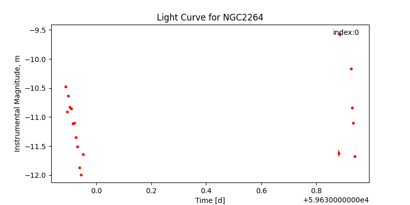
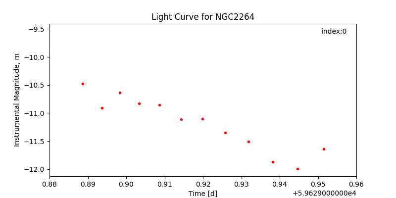
With regards to the type of variation in the curves, it’s a bit hard to tell with this little data plotted. So far it is clear that there are some dips present, but it’s hard to tell from what exactly. As I combine more curves, I will be able to have a better idea of the types of variation present, but for now there are clear magnitude variations that can be seen. As far as variations in different bands, they could be due to varying accretion of gas onto the central star or from star spots and temperature variations and the planets are rotating. It’s also possible that there are planets transiting!! But that’s probably unlikely since this is a relatively young cluster of low mass stars.
Mass Accretion Activity
The mass accretion rate activity was straightforward for the most part and I had fun working through a lot of the same problems I have seen thesis students tackle over the last few months (albeit in a much more in-depth and complicated manner). My minimum Mdot value was 4.808*e-6 while my max was 1.47*e-5. This agrees reltively closely with published mass accretion rates for young T Tauri stars, many of which I saw at around e-7 or e-8 solar masses per year. To measure Mdot for our stars, we will need the flux observations at a range of bands as we have discussed in class, as well as photospheric modeled values of the fluxes and a relatively accurate distance measurement to our cluster. It makes complete sense, but I simply never thought much before about how essential distance would be in measuring accurate luminosities and mass accretion rates.
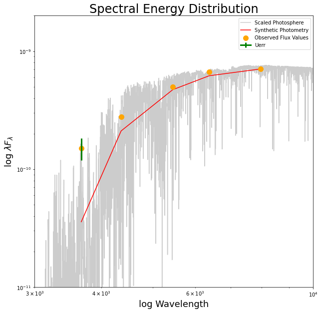
When applying this method of measuring Mdot to our own stars, we want to be careful to take into account the uncertainties in our own measurements, due to the capability of our own telescope, the atmospheric influence on our measurements, and the extinction in the ISM. With respect to the calculations we carried out, by scaling the photosphere we assumed an equal ratio between each band and thus did not account for variation across wavelength. I am curious as to what sorts of error are introduced from the Bessel Function filters we introduced in our calculations as well. Below is the final spectral energy distribution plotted with the scaled photosphere in grey and U band uncertainties in green.
Finally, the mass accretion rate curve is plotted below with the y axis ranging between e-5 and e-6. The actual curves are a bit hard to make out, and I was not exactly sure how to plot the entire curves so the short term variations could be seen clearly.

My Paper
This week I chose The Initial Mass Function and Young Brown Dwarf Candidates in NGC 2264 by Sung et al 2008. The paper is the third paper released by Sung et al on this topic and covers an analysis of over 67,000 stars in NGC 2264. They used this data to probe the initial mass function of the star forming region of NGC 2264. To this end, they constrained membership using a number of complex techniques that I am still working to understand. From what I can tell they utilized spacial distributions of stars (Fig 9 below) in multiple wavelengths (as seen on the right). By comparing emission in at Hα and in the X-ray band, they were able to determine a likelihood of membership from each star. I looked to see if they used velocities of any of the stars (through something like the Banyan sigma tool) but I couldn’t find anything too clear. They mentioned velocity gradients multiple times, but nothing much about how they might use the observed velocities to constrain membership.
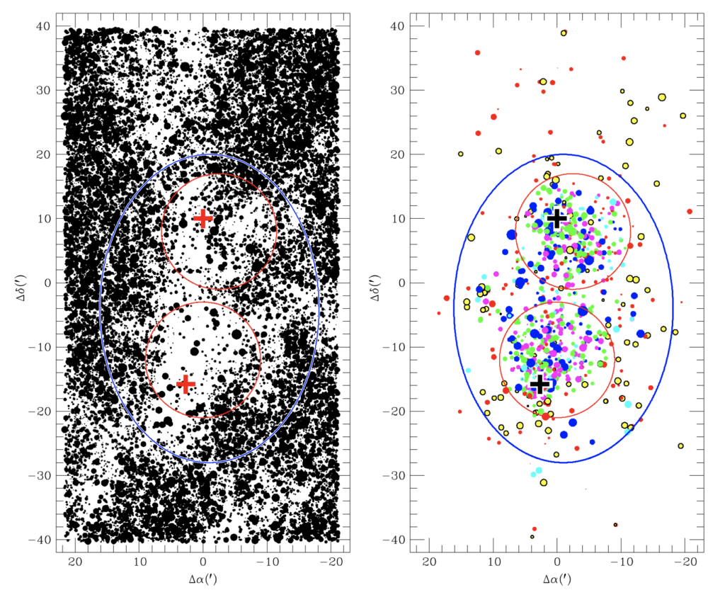
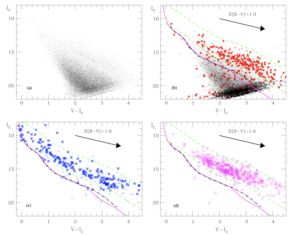
Once they constrained membership, they plotted V band verses V-I band color magnitude diagrams. These are shown below in Figure 12 from the paper. The red dots are Hα emitting stars while the blue are X-ray emitting ones. The thick line in each represents the ZAMS or Zero Age Main Sequence. This is the main result of the paper, and isochrone fitting and age determination is left for a future investigation. Overall, this paper has provided us a lot of information on the cmd generation and how to best estimate the uncertainty in our cluster membership estimates. (It has also given me quite an appreciation for the level of detail necessary to fit an accurate IMF).
